Looks like I have a face at Twitter now. Been tweeting a bit in the last 12 hours or so, and seems to be running smoothly. Let’s hope it stays that way. 🙂
Category Archives: Conventions
Twitter = Big Fail
So far at least. After much ballyhooing from friends, I joined Twitter yesterday. Bad move. For months I’ve heard “Twitter will change your life” and “humankind will never again be able to function without Twitter” (although I seemed to be just fine without it). So I join, and find that the system has such massive dysfunction that it can’t even upload a tiny avatar picture properly. And apparently, Twitter’s been having this ongoing problem for at least three consecutive months, and still can’t get a grip. I’d normally blame myself and assume user error, but when I click the empty avatar box that has a question mark in it, I see my photo so I know it’s in the system. It’s Twitter’s problem, not mine.
To add to the fun, I’m getting emails from friends saying that they know I’m on Twitter, but can’t find me. And on top of that, after the initial photo upload failed and I couldn’t get back into my page, I redid my password and created a new one, just to be sure. So now my account oscillates between recognizing and not recognizing two different passwords. Yeah — Twitter sux in a big way.
If anyone knows an avatar fix, gimme a holler.
Don’t Get Me Started
 (left, art by Alphonse Mucha, 1905)
I’ll get to Mucha in a moment, but I’d like to say that David Apatoff’s Illustration Art blog has been one of my faves the last couple of years. I don’t always agree with everything he says, but I respect his views, which are genuine and well-said. His most recent post is about Peter Max. Although I’m not a fan of Max’s pop art work, David eloquently makes a point near and dear to my heart about illustration vs. fine art. With apologies to David for the copy/paste, here’s what he said:
“Artists and critics always chafe at the restrictions imposed by patrons or censors who interfere with the artist’s original concept. In fact, it seems that illustration is held in lower regard than “fine” art mainly because the illustrator’s vision is subject to the whim of some client or art director. There is some truth to that criticism, but Peter Max demonstrates how the lack of restrictions can be just as hazardous to the quality of art.
In my view, Peter Max, along with Andy Warhol and Leroy Neiman, are good examples of artists whose work was spoiled and made rotten by excessive freedom. Today’s fine art scene offers far more examples of artists whose self-indulgent, decadent work has little relevance or value outside their own cloistered circle. When the world provides resistance to an artist (whether in the form of a tough deadline, or a client’s demands, or poverty, or totalitarian censorship) it can have a beneficial effect on the art. As the old proverb says, ‘the wind in a man’s face makes him wise.’
Artistic freedom can help or hurt art. But if great art can be produced in a prison cell or a concentration camp, it’s silly for the fine art community to suggest that it can’t also be produced within the constraints of a commercial art studio.”
May I offer a “hell yes“? Way to go, David. I couldn’t agree more–which brings me back to Alphonse Mucha. The art pictured above is Mucha’s response for a 1905 Moet & Chandon champagne advertisement. It’s commercial art all the way, but is it any less a piece of imagination, craft, design, and inspired execution at its finest because it was created for an advertisement? And where does it say that a curator or pseudo-intellectual has to validate something that beautiful for it to be considered art for the ages?
Several years ago, I had a heated exchange with a reknowned local ‘fine artist’ who specialized in ill-conceived installation sculptures. He was staring at a piece of illustration in a gallery and asked my opinion. I gave it to him, and he responded, “The trouble with illustration is that it can never be art in the highest sense because it always answers to someone. True fine art doesn’t answer to anyone and therefore will always be a higher calling.”
Those were fighting words.
After I reminded him of the numerous city council and political hoops he had to hop through for approvals, and the gallery collectors whose dollars he relentlessly chased, I offered the following gentle morsel: “Just because you masturbate on a wall and fool yourself into believing it’s got value doesn’t mean you’re an artist.” Maybe not one of my finer moments, but I’m still proud of that one. I still believe the very best commercial illustrations of a superior talent like Alphonse Mucha doesn’t need a curator or nostalgia to validate it.
In the end, let me say as a proud, working professional illustrator, that it’s not just the interaction with terrific art directors, or the answering to deadlines, or to problem-solving, or to strife, that can perhaps shape a piece of commercial illustration into something potentially special. ALL of those things are potentially huge, positive factors, but it’s always about an artist’s singular, skillful human response to a moment and to a context. That response must not only solve a problem and serve a client, but it must be strong enough to withstand the repeated scrutiny of that client’s corporate masters and the timeless, infinite scrutiny of a potentially worldwide audience. And if in fact, that artist’s response can pass these tests and not only maintain its pure expression, but in fact, be emboldened by these challenges and embrace those challenges to transform into something transcendent…..then which art is really ‘the higher calling’?
DARKEST HOUR is upon us!
 The good folks at Pyr sent me gorgeous new copies of Mark Chadbourn’s fantastic AGE OF MISRULE: BOOK 2 — DARKEST HOUR. Received them yesterday, and the books printed great. I’m proud to be illustrating the covers for this series and Book 3 should be coming soon, from what I understand. Go, Pyr, go! 🙂
AWAY FROM HERE
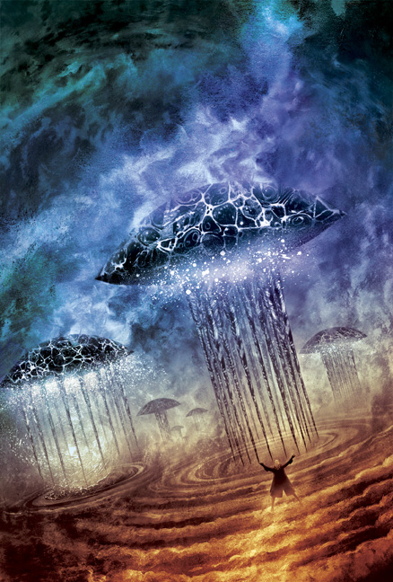
 Unveiled — here’s my cover illustration for this September’s issue of ASIMOV’S SCIENCE FICTION. It’s based on the issue’s lead story, Lisa Goldstein’s “Away From Here.” She was recently a Nebula Award finalist, and her new story is terrific. It’s about hotels, wanderlust, and passing strangers.
 A quirk in the story (no spoilers) inspired not only the subject, but also my compositional solution. A bit of art history: Coles Phillips was a popular American illustrator of the 1910’s and 20’s. His work was all the rage in advertising. He’s famous for his “Fadeaway Lady” illustrations (see left) where he juxtaposed foreground and background elements of the same color. The results caused readers to look twice and complete the pictures with their imaginations.
It was fun to see how much I could subtract from an image and still have it “read.” Thanks to art director Victoria Green for the encouragement, and to La Julia and Traci for helping me find magic where others might only find the mundane.
Chesley Awards Deadline Approaches
 Wow — the Association of Science Fiction & Fantasy Artists have posted a terrific gallery of 2008 sf/f art. They posted it for ASFA members to vote upon for the 2009 Chesley Awards nominating process. It’s merely a suggestions gallery and NOT the Chesley Awards final nominees’ list. Deadline for ASFA members to submit nominating ballots is Friday, May 30th. The final nominees will be announced by ASFA later this summer.
Good news for Yours Truly — four of my own works are included in the suggestions galleries. Again, these are NOT Chesley Award nominees, but merely images that ASFA selected for possible nomination consideration:
Best Cover Illustration / Paperback:
John Picacio — FAST FORWARD 2
Edited by Lou Anders
Pyr, October 2008
Best Cover Illustration / Hardcover:
John Picacio — VIEWPOINTS CRITICAL (pictured here)
By L.E. Modesitt, Jr.
Tor, 03/2008
Best Cover Illustration / Magazine:
John Picacio — ASIMOV’S September 2008
Interior Illustration:
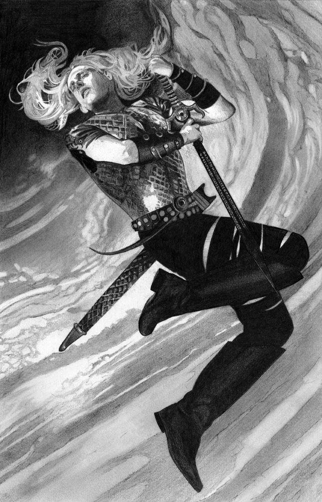
John Picacio — Elric: The Stealer of Souls
By Michael Moorcock
Del Rey, 2008
Check out the entire Chesley Awards Suggestions Gallery! And if you want to become an ASFA member, here’s how.
MISSIONS UNKNOWN!
 San Antonio — we have liftoff. Horror/dark fantasy writer Sanford Allen, tech guru Paul “The Mac Guy” Vaughn, and Yours Truly have banded together and formed MISSIONS UNKNOWN! — a team blog celebrating science fiction, fantasy, and horror in San Antonio. The blog’s main mission is to celebrate SA-based creators and fans of sf/f/h and everything related to the literature and art of sf/f/h. That includes books, authors, artists, comics, prose, and the making and enjoyment of all of them.
I’m stoked about this. This is the kind of thing I’ve wanted San Antonio to have, for a very long time. If you live in SA — and love science fiction, fantasy, or horror — please visit daily, comment and make your voice heard. MISSIONS UNKNOWN! belongs to you.
Kubrick In My Head
 The other night, I was watching the DVD special features for Stanley Kubrick’s 2001: A SPACE ODYSSEY. I’ve seen the film more times than I can count, but never these special features. One of them closed with the following words by Kubrick:
“The most terrifying fact about the universe is not that it is hostile but that it is indifferent; but if we can come to terms with this indifference and accept the challenges of life within the boundaries of death – however mutable man may be able to make them – our existence as a species can have genuine meaning and fulfillment. However vast the darkness, we must supply our own light.”
I’ve certainly heard the same phrased differently, but never that eloquently. Definitely inspiring. Words to create by, and live by, I’d say….
Hugo Awards: Voting Now Open
 The 2009 Hugo Awards Online Ballot is now available. The deadline for voting is midnight (2359hrs.) Eastern Daylight Time (EDT) July 3, 2009. In order to vote, you must be a supporting or attending member of Anticipation (otherwise known as this year’s World Science Fiction Convention in Montreal). They’re available here. Supporting memberships are relatively inexpensive $50USD/$55CAN, and they’re a downright steal when you consider that your membership grants you access to a Hugo Voter Packet containing the vast majority of this year’s nominated novels, stories, and art.
In the Best Professional Artist category, I’m proud to be nominated along with Dan Dos Santos, Bob Eggleton, Donato Giancola, and Shaun Tan. Voters for the Pro Artist Hugo are asked to consider published works by the nominees from the year 2008. For voters’ convenience, here’s a visual list of my published art from 2008. In fact, if you’re really pinched for time, you can just glance to the right and scroll through all of my ’08 work in the sidebar. 😉
It’s a helluva Hugo ballot in all categories, and I’m honored to be on it!
Coming Soon: Joe Mallozzi Talks ELRIC!
 Michael Moorcock’s ELRIC: THE STEALER OF SOULS will be the June Book of the Month Club selection at Joseph Mallozzi’s super-fun blog. He was the co-executive producer of STARGATE ATLANTIS and is the Consulting Producer of the forthcoming STARGATE UNIVERSE. Joe’s invited Mike himself to answer reader questions. I’ll definitely be checking that out! 🙂
ARE YOU THERE AND OTHER STORIES
 Unveiled: here’s my front cover illustration for Jack Skillingstead’s collection ARE YOU THERE AND OTHER STORIES, an October hardcover release from Golden Gryphon Press. I’d like to say a few words about Skillingstead and this book, especially for those who have never heard of him. At the end of the year, all of the hip sf critics and pundits will rack up their “Top 10 Books of 2009.” I suspect ARE YOU THERE will be on some of their lists, or at the very least, the ones who spot great writers when they first encounter them. Why? Well, this is Skillingstead’s debut book, which makes it doubly amazing that this collection of stories is so potent, emotional, and provocative. It blew me away. This is a book for sf readers who savor great questions as much as (if not more than) firm answers. I’m really proud to be the cover illustrator for this one.
A couple of process notes about the art: this illustration was directly inspired by Jack’s stories, but it’s not a literal translation of any of them. Although it’s a very simple graphic solution, it took me a while to gather the courage to go this way. If you click on Amazon (for a limited time until it gets replaced with the final cover), you’ll see my aborted original solution where a man is literally trying to hug a phantom, which was inspired by the stories, but perhaps was just as much me trying to capture a collection that isn’t easily pegged. It’s an interesting idea, and a work-in-progress (it even includes something I borrowed from a previous cover as a stand-in design element for the time being), but I thought that original picture was failing to communicate. It was a gut feeling, and I couldn’t shake it. So I ditched it.
Huge credit must be given to Gary Turner, publisher of GGP, and Jack himself for allowing me to veto the picture. They had already approved the cover art, and the distributor had approved it as well for catalog purposes, but after much soul-searching, I just felt it was lacking. It’s highly unusual to start over at this stage, but because the client had the catalog image as a safety net, I started over and revisited a different idea from my initial sketches. Originally, I’d abandoned this idea because I couldn’t think of a way to turn it into a wraparound composition, which is a prerequisite of all GGP cover art. It could be an amazing front cover image though, and most importantly, it was utterly resonant with the tone of Jack’s book. So I went for broke and did it. All the while, I wasn’t sure if the piece was too simple and too spare, but stayed the course. And this is how the full wraparound composition turned out:
I printed up a scale mockup of how the art might wrap around a GGP book, and looked at the abstract cloud forms on the back cover (left half of the picture below). The full wraparound makes me a bit twitchy because the left half is so spare, compared to past work. However, seeing my little mockup was a great reminder of design context and that the back cover art works beautifully when the art finds its destination wrapping around a book. And that’s what matters, in this case.
GGP gives its authors more cover art input than normally afforded by most publishers. So when Jack said that I “nailed” the art and that he couldn’t stop staring at it, it was all worth it. Thanks again to both he and Gary, for keeping the faith. Thanks to Matt Fulcher and Sanford Allen for being partners-in-crime as I figured this out. I love this book and can’t wait for it to be published.
VIEWPOINTS CRITICAL: Now a TPB!
 Saw my cover art face-out for L.E. Modesitt, Jr.’s excellent collection VIEWPOINTS CRITICAL (Tor) the other day at Borders/Alamo Quarry. What caught my eye is that this is a trade paperback edition of a book that originally released in hardcover last spring. I didn’t know a tpb edition of this book existed until now. Hooray, Tor! Congrats, Lee. 🙂
Coming Up For Air
It’s been a hellacious week here. Even more than usual. This week, I turned in final art for two covers — Jack Skillingstead’s ARE YOU THERE (Golden Gryphon Press) and the limited edition of Dan Simmons’ THE TERROR (Subterranean Press). I’ll share the end results here, as soon as the publishers say it’s OK. While working on those, I’m juggling three other assignments including lots of Elric work for Del Rey, which continues apace. More coming soon…:)
AGE OF MISRULE: BOOK 3 / ALWAYS FOREVER
 Here’s my final cover illustration for the forthcoming Pyr edition of Mark Chadbourn’s AGE OF MISRULE: BOOK 3 / ALWAYS FOREVER. The first book of the trilogy, WORLD’S END, is now available. (And I like the cool banner ad Pyr did for all three books over at Locus Online. Nice job, Amy!) Like my previous two MISRULE covers, I’m glad I was able to improve the cover art from its initial catalog version. And below, you can see how the finished cover will look when it hits US shelves later this summer.
 It’s been super-busy here in recent days and I’m glad that Pyr’s Lou Anders and author Mark Chadbourn have been way ahead of me sharing this finished art with the rest of the universe. Thanks to all who have said nice things about the covers over at Tor.com and elsewhere. Very much appreciated! 🙂 I’m glad the covers are helping these amazing books connect with epic fantasy readers everywhere.
2009 Asimov’s Readers’ Poll Winner!
 Wow, this is a good week for awards news here. SFSignal has the list of the 2009 ASIMOV’S and ANALOG Readers Polls. Both magazines announced their winners at this weekend’s Nebula Awards festivities. Very cool — I tied for first place, along with Tomasz Maronski, for Best Cover Artist in the ASIMOV’s Readers Poll! Hurray! Pictured here is my cover art for the Sept. ’08 issue, which featured the Locus Award-nominated story “The Ice War” by Stephen Baxter. Thanks very much to the readers who were kind enough to acknowledge my work. Very much appreciated! 🙂
2009 Locus Award Finalist!
 Good news — the 2009 Locus Award Finalist List went out yesterday. I’m one of the five finalists in the Artist category!
Here’s the Artist list:
Bob Eggleton
John Picacio
Shaun Tan
Michael Whelan
Charles Vess
The Locus Award winners will be announced in late June in Seattle. I’m thrilled and honored to be in this year’s top five and it’s a heckuva list all around. Very pleased to see Pyr’s FAST FORWARD 2 with two stories amongst the finalists: “True Names” by Benjamin Rosenbaum and Cory Doctorow and “The Kindness of Strangers” by Nancy Kress. Congrats to editor Lou Anders for that! I illustrated the cover of the Sept. ’08 ASIMOV’S and my cover illo was based on Stephen Baxter’s “The Ice War” which is one of the finalists for Best Novelette. Congrats to Stephen and of course, editor Sheila Williams.
Congrats to everyone on the list….it’s an honor to be amongst you. 🙂